Analysis of Optical Coherence Tomography Scans
Retinal OCT Image Analysis
Optical Coherence Tomography (OCT) is a non-invasive imaging technique that provides high-resolution cross-sectional images of the retina. It uses low-coherence light to measure the echo time delay of light reflected from different retinal layers, creating detailed images crucial for diagnosing and managing various eye conditions. OCT is widely used to assess retinal structures, enabling early detection and monitoring of eye diseases such as: Age-Related Macular Degeneration (AMD), Diabetic Retinopathy (DR), Glaucoma, Macular Edema, and Retinal Detachments.
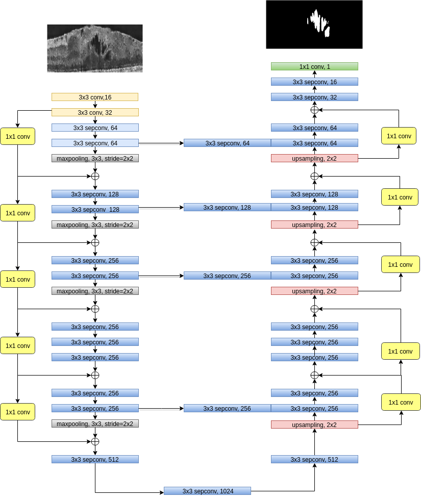
In this project, we have developed several methods for Retinal OCT Layer Segmentation, Retinal Fluid Segmentation, Retinal OCT scans Enancement through denoising, and Retinal OCT Image Synthesis.
---
---
<div class="caption"> Depthwise Separable Convolutional Network for Retinal OCT Fluid Segmentation Architecture <a class="citation" href="#girish2019depthwise">(Girish et al., 2019)</a> .
</div>

<!--
  See https://www.debugbear.com/blog/responsive-images#w-descriptors-and-the-sizes-attribute and
  https://developer.mozilla.org/en-US/docs/Learn/HTML/Multimedia_and_embedding/Responsive_images for info on defining 'sizes' for responsive images
-->

  <source
    class="responsive-img-srcset"
    srcset="/assets/img/1-480.webp 480w,/assets/img/1-800.webp 800w,/assets/img/1-1400.webp 1400w,"

      sizes="95vw"

    type="image/webp"
  >

<img
  src="/assets/img/1.jpg"

    class="img-fluid rounded z-depth-1"


    width="100%"


    height="auto"


    title="example image"


    loading="eager"

  onerror="this.onerror=null; $('.responsive-img-srcset').remove();"
>
</picture>
</figure>
</div> <div class="col-sm mt-3 mt-md-0">

</div> <div class="col-sm mt-3 mt-md-0">

</div>
</div>

```<div class="caption"> This image can also have a caption. It’s like magic. </div>
You can also put regular text between your rows of images, even citations (Girish et al., 2019). Say you wanted to write a bit about your project before you posted the rest of the images. You describe how you toiled, sweated, bled for your project, and then… you reveal its glory in the next row of images.


The code is simple. Just wrap your images with <div class="col-sm"> and place them inside <div class="row"> (read more about the Bootstrap Grid system). To make images responsive, add img-fluid class to each; for rounded corners and shadows use rounded and z-depth-1 classes. Here’s the code for the last row of images above: –>
<div class="row justify-content-sm-center">
  <div class="col-sm-8 mt-3 mt-md-0">
    {% include figure.liquid path="assets/img/6.jpg" title="example image" class="img-fluid rounded z-depth-1" %}
  </div>
  <div class="col-sm-4 mt-3 mt-md-0">
    {% include figure.liquid path="assets/img/11.jpg" title="example image" class="img-fluid rounded z-depth-1" %}
  </div>
</div>
References
2019
- IEEE EMBC’19Depthwise separable convolutional neural network model for intra-retinal cyst segmentationIn 41st Annual International Conference of the IEEE Engineering in Medicine and Biology Society (EMBC) 2019, 2019